Thursday, 22 June 2017

Unique Book Covers

Bright Shiny Morning by James Frey, design by Gray318 (John Murray 2008)
For this amazingly seedy cover, designer Jon Gray apparently drew the type first and then took it to sign shop to be made. The finished neon sign, photographed for the cover, now hangs in the office of James Frey’s UK publisher John Murray (or at least it used to).
This silhouette of a bird shows a woman's face signifies freedom, which encapsulates the feeling of youth and how one is blessed to have it.
Sweet Bird of Youth by Tennessee Williams, design by John Gall (New Directions 2008)
The Way Through Doors by Jesse Ball, design by Helen Yentus and Jason Booher (Vintage 2009)
I like this cover, because it is reminiscent of a seemingly endless hall of doors.
Now I've decided to do research on pop-up books, because it will be more appealing to dyslexics that way.
Based on Alice In Wonderland, this shows the scene of the Unbirthday Tea Party, with bright colours and tea cups littering the white marquee. Alice's scowl shows that she's not enjoying the party very much, while the Mad Hatter and the March Hare try their best to make sure she enjoys it, despite the looks on their faces clearly enjoying her non-amusement.

The cover for Monster House (Not to be confused with the animated film of the same name) also goes for bright colours, though the scheme sticks to mostly blue except the monsters. The monsters in question are presented as jolly and friendly, but beneath the darkness lies a pair of eyes that tell the reader there may be more than that.

There are actually two covers that represent this book, and they are both done in the traditional British colours, red, white and blue. There are also famous landmarks of London on the two covers, which show that it's really about London.

Thursday, 18 May 2017

Dyslexia research


Being dyslexic makes it more difficult to recognize patterns.
What might occur if the person were unable to recognize the pattern? What might occur if they were able to recognize the pattern, but it took additional time to find a particular card?

Dyslexics worldwide face this very challenge. The Yale Center for Dyslexia and Creativity estimates that 20% of the population is dyslexic, yet designers are generally ill equipped to create designs that are accessible for dyslexic users.

Dyslexia is a cognitive learning disability in which the brain has difficulty with phonological processing, or translating words into sounds. As a result, reading is a difficult task. Due to their cognitive problems in decoding written language, many dyslexics will confuse similar words so that “CAT” may be confused with “ACT”. Although dyslexia affects a large percentage of the population, it manifests in a variety of ways, such that one person might find his or her dyslexia makes reading mildly difficult while another struggles with even the simplest of sentences.

Statistics differ on the percentage of the population that has dyslexia. The British Dyslexia Association claims 10% of the population is dyslexic while the Dyslexia Research Institute in America claims it could be as high as 15%. Regardless of the exact number, the fact remains that this is an enormous number of people. The number of blind users, for example, pales in comparison to the number of dyslexic users, but it is likely that most designers have a far clearer picture on how to design for blind users compared to how to design for dyslexic users.

 I developed ten questions that I wanted to ask dyslexic users:

  • When were you diagnosed with dyslexia?
  • How would you describe your dyslexia and the impact it has on others?
  • What are the challenges associated with your dyslexia?
  • What are the potential benefits of being dyslexic?
  • What websites or mobile/tablet applications do you find particularly easy to use?
  • What aspects of these sites or mobile/tablet applications make them easy to use?
  • What websites or mobile/tablet applications do you find particularly difficult to use?
  • What aspects of these sites or mobile/tablet applications make them difficult to use?
  • What would you like people to know about dyslexia?
  • If you have any comments or additional information, please write it below.

Some dyslexics said they had little trouble reading but had trouble writing; others were exactly the opposite. Some dyslexics explained that reading maps was their biggest challenge while others stated that their dyslexia extended beyond words to mathematics and that numbers gave them the most trouble. Still, others explained that they were clumsy and that this was connected to dyslexia. What I originally believed was an issue with words, extended far beyond just reading.

As noted, previous discussions of dyslexia in web design have centered on creating better typography or color contrasts. This, however, does little to quell the anxiety a dyslexic user may experience upon encountering an e-commerce website. Imagine having difficulty understanding how much money you’re about to spend or being unsure you’ve written your address correctly! One dyslexic wrote to me, “I am scared to pay things via Internet or to take money from machines [sic]”.

Second, I learned that some dyslexics see their dyslexia as an advantage. There is no “cure” for dyslexia, but many dyslexics find coping mechanisms that allow them to overcome the learning disability. The success of dyslexics in business, for example, has been well documented, with Richard Branson as perhaps the most high profile example.

In his most recent book, “David and Goliath: Underdogs, Misfits, and the Art of Battling Giants”, Malcolm Gladwell used dyslexia as an example of a “desirable difficulty” in an attempt to show that dyslexia may actually be an asset for some people. Gladwell points specifically to the number of successful entrepreneurs who are dyslexic and attribute their success to their dyslexia. Gladwell points especially to Gary Cohn, the President and COO of Goldman Sachs. This struck me as a strange assessment, so one question I asked many dyslexics was how they thought their dyslexia may have benefited them. Most dyslexics explained that their approach to problem solving differed from their peers. Dyslexics told me they were able to “connect the dots” in their head in a way that differed from others and that this was a distinct advantage in problem solving.

Taken from: http://www.uxbooth.com/articles/designing-for-dyslexia-part-1/

Dyslexia typeface:

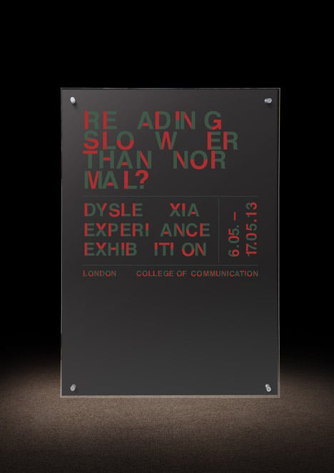
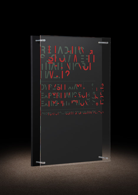
London designer Dan Britton has created a typeface that's intentionally difficult to read to simulate the problems faced by people with dyslexia.

Design graduate Britton – who was diagnosed with dyslexia in his third year of university – wanted to create a typeface that would demonstrate the effects of the disorder, which impairs reading ability. Dyslexia is estimated to affect 10 per cent of the world's population, according to UK charity Dyslexia Action.

"What I wanted to do was recreate or simulate the emotions of reading with dyslexia to try and put across how frustrating it is to try and read something simple," Britton told Dezeen.

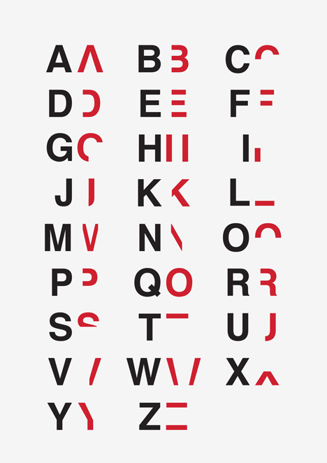
He sliced up the commonly used Helvetica typeface – created in 1957 by Swiss designer Max Miedinger – to delete 40 per cent of each letter and number, removing their key characteristics but leaving enough to make them just about legible.

The intention is that a reader has to take their time to decipher which letters are used in words and sentences, slowing them down to the speed of someone with dyslexia. 

Dyslexia typography by Daniel Britton
This is how the text usually looks to normal people, which is being used to promote and exhibition about dyslexia. Meanwhile, this is how it'll look to people with dyslexia...
Dyslexia typography by Daniel Britton

Here is how the typeface compares with the Helvetica font:

Dyslexia typography by Daniel Britton

Wednesday, 8 March 2017

MMc403.3 Project Research Blog

https://skift.com/2016/07/13/the-25-best-tourism-websites-in-the-world-in-2016/#1

I have decided to do a website based around Travel blogs, because I've been fascinated about the many places I've heard about that make good locations. Also, the way these websites are presented are usually bright, sunny and colourful, like they want you to have fun and draw you into choosing your holidays.

And now, here's some research I did on this project.


This website is all about one of Colorado's towns, Telluride, which is a city based around skiing, snowboarding, and other alpine-related activities. It tells you as such because it thrusts pictures of people skiing and snowboarding, but it also balances things out by including art classes in there as well.

When you open the website, you get a nice animated video that shows you what people do in Colorado, like skiing and hanging out drinking, and there are some nice atmospheric shots in here too.

Other than that, the font looks normal, and the background is black, but that rarely matters as the website shows you the numerous things you can do in Telluride, like going to festivals, art galleries, shopping and even activities for kids.


This website is about Finland and what wonders it entails, like the Aurora Borealis and Helsinki. Like Telluride, it's very alpine based, except it's more laid back. As soon as you enter the homepage, it greets you with "17 reasons to visit Finland in 2017", and if you scroll down, there are lots of articles about the different parts of Finland, like snow dogs and dipping in icy water.

The font is shown in a very classy manner, with some different styles shown here and there. You can also find out that Lapland (Santa Claus' supposed hometown) is situated in Finland and that fact that Moomin originated in Finland. when you scroll down a page, a new image shows up behind the text, which is a very good design idea.


According to skift.com, this was "the most expensive website to build", and it shows with lots of links in the forms of images and videos. It's very colourful, and that's what most people think of when you think of Dubai. There is also this sidebar that'll take you to any page should you so desire,

No matter what page you're on, it makes sure to throw lots of images in your face and completely win you over into joining the country it's advertising.

Not only that, the images also create the feeling of Dubai rather well. It really makes you feel like you're they're thanks to the authenticity.

The Tourism Australia website is a bit more modest than the Dubai one, mainly because it sticks with one colour scheme: blue. There are different kinds of shades of blue dotted around the homepage to make the website very unique.

It keeps the colour scheme all throughout the website, while going into detail about the different states of Australia, while also doing an excellent job at showing images that pull you into the locations.

Not only that, but it also gives detailed descriptions about the lesser known locales of Australia such as the Pink Lake. This website is perfect for people who want to find out more about Australia and plan to visit it someday.

Like Tourism Australia, San Francisco Travel also keeps to one colour scheme: orange. It fits the website well because the Golden Gate Bridge, which is based in that city,is actually orange, and thus is the colour of this website as well.

Like most of the other websites I've researched, it also has a list of reasons the viewer should be visiting this city, as well as making them intrigued tanks to the kooky art style of the man with the afro greeting them as they visit the home page.